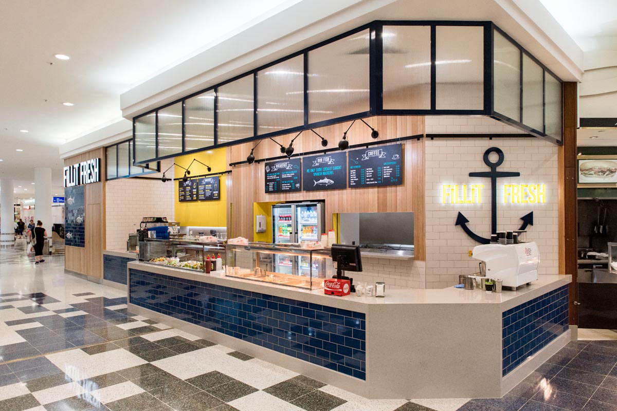
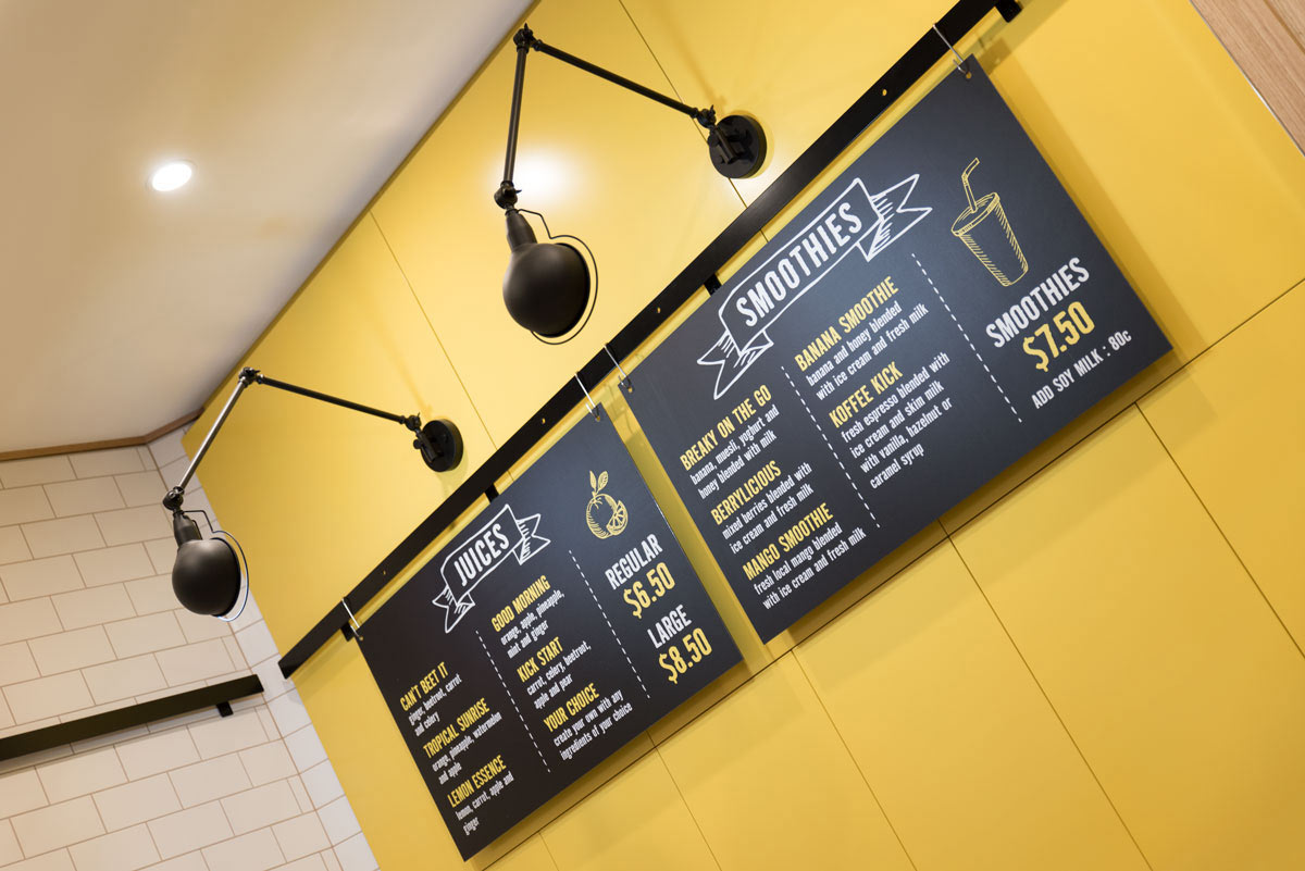
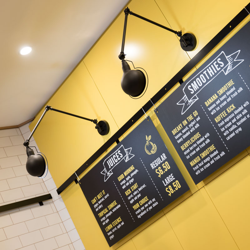
“The impact of the vibrant colour palette is balanced by the use of crisp whites & polished oak paneling.”

“The impact of the vibrant colour palette is balanced by the use of crisp whites & polished oak paneling.”
Fillit Fresh
our services: concept design, ff&e, compliance & approvals, graphic design, construction documentation
location: Stockland Cairns SC, Earlville
size: 65sqm
completed: September 2016
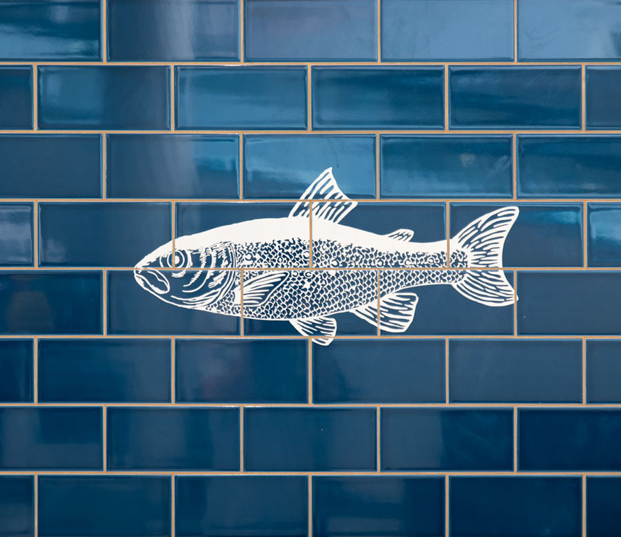
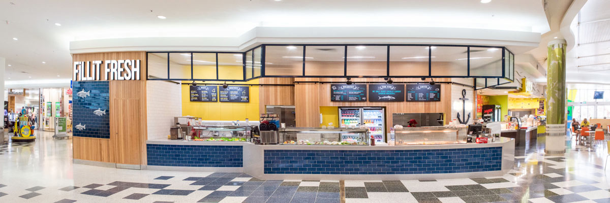
Foodcourts are highly demanding environments, challenging the designer’s role to create an outlet that entices. Bold type-driven signage plays an important role here for both for style & attention. The branding story developed for Fillit Fresh continues onto the small details such as the fish etched on the glazed blue tiling. The impact of the vibrant colour palette is balanced by the use of crisp whites & polished oak panelling. Whilst the long glazed cabinets & white coffee machine are foremost for the customer’s attention. A delighted client & enthusiastic customers are a satisfying reward.




Related Projects
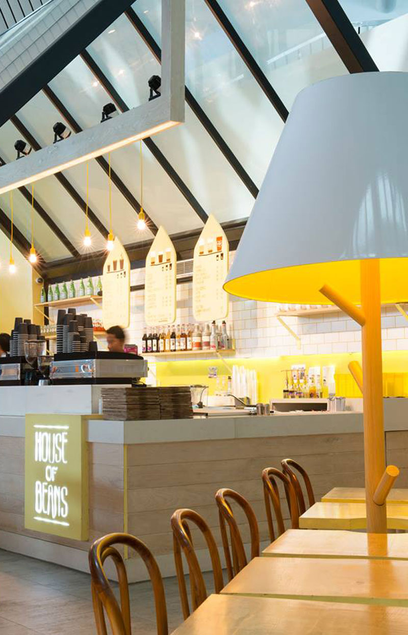
Whilst the coffee bean is the hero in the House of Beans – this is a vibrant and playful brand offer. An uplifting environment that stands out in the terminal as often weary departing passengers are looking for place to rest as they await their flight.
We’ve designed many many coffee outlets over the years – we know the right formula; and Silk was the happy opportunity where we could apply the optimal ingredients. The design is carefully targeted at an inner city demographic, with a well-defined customer base.
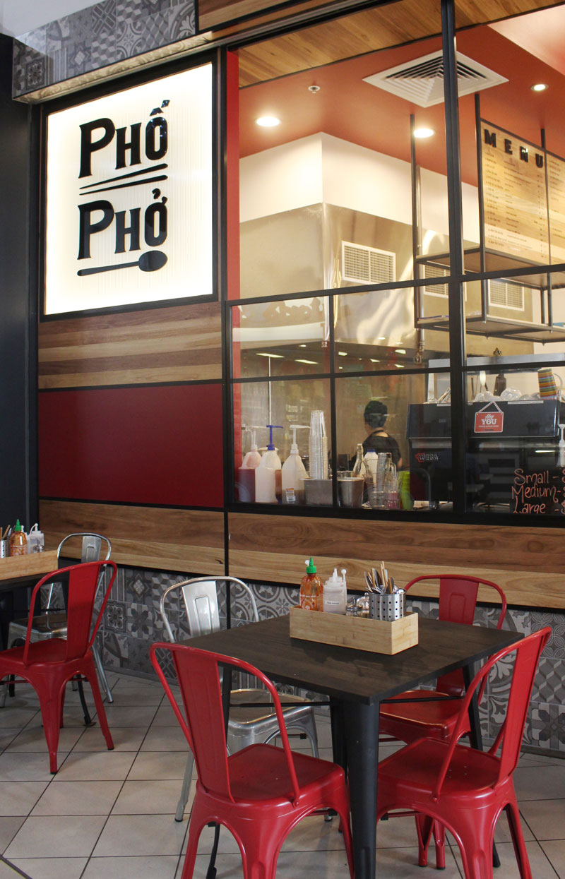
Bringing the tradition of Vietnamese food to this Northern Cairns Shopping Centre required more than simply great food. In a competitive foodcourt environment a restaurant must convey a clear message from a distance – in this, Pho Pho succeeds.

