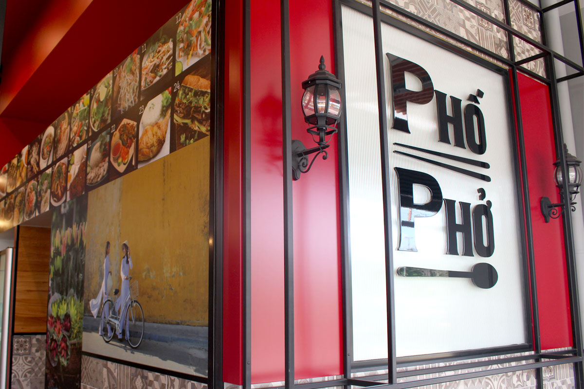
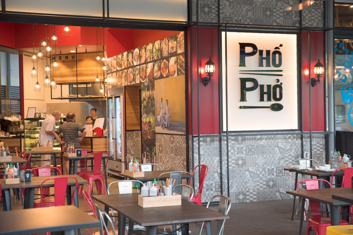
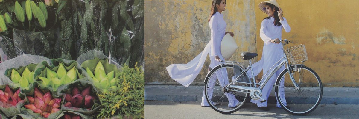
“The palette is bold of colour & iconic with its symbolism of Vietnam. This is street food, so it embraces the energy of pattern & vibrant finishes.”
“The palette is bold of colour & iconic with its symbolism of Vietnam. This is street food, so it embraces the energy of pattern & vibrant finishes.”
Pho Pho Vietnamese
our services: concept design, compliance & approvals, construction documentation
location: Smithfield SC, Smithfield
size: 70sqm
completed: August 2017
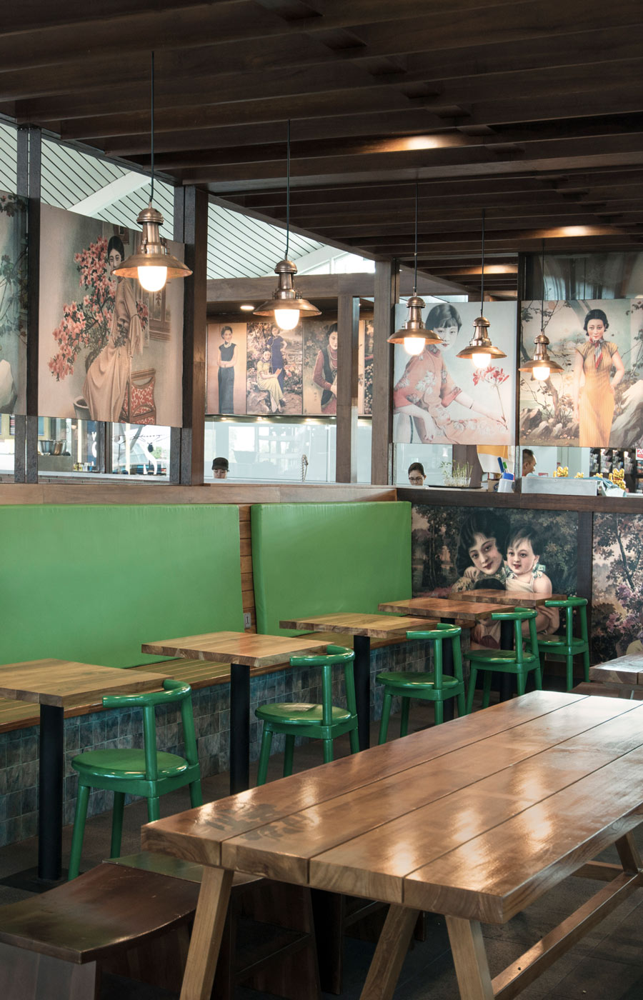
Bringing the tradition of Vietnamese food to this Northern Cairns Shopping Centre required more than simply great food. In a competitive foodcourt environment a restaurant must convey a clear message from a distance – in this, Pho Pho succeeds.
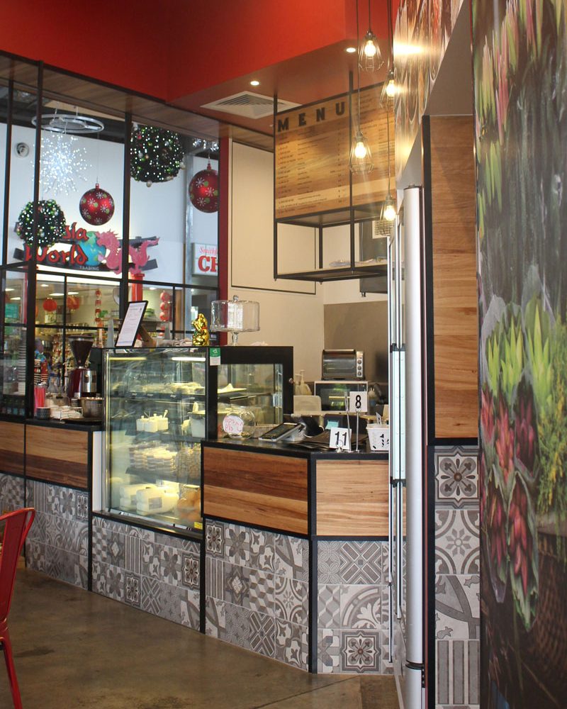
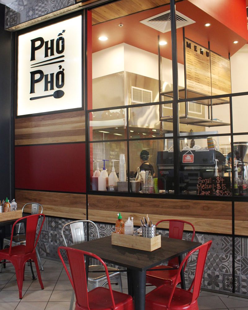
A compact kitchen combining the theatre of fresh preparation with a back of house was carefully planned to work efficiently for the staff and maximise the visual statement to the customers. Balancing the approach & service flow of three seating areas required the design to work from all sides. The palette is bold of colour & iconic with its symbolism of Vietnam. This is street food, so it embraces the energy of pattern and vibrant finishes. The customers prove its success.
Related Projects
Drawing upon design styling influences from traditional urban Shanghai, the sheltering structure provides a comfort for waiting passengers & friends. The brand begins with its Two Dragons logo with a palette of green, black & rustic brickwork.
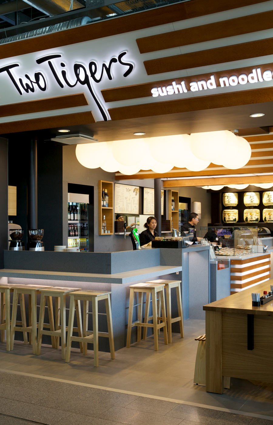
Originally the Two Tigers brand was developed for an Australian market application. After planning was undertaken for several Airport locations – luck would have it that Helsinki Airport, Finland would be the first location to open.
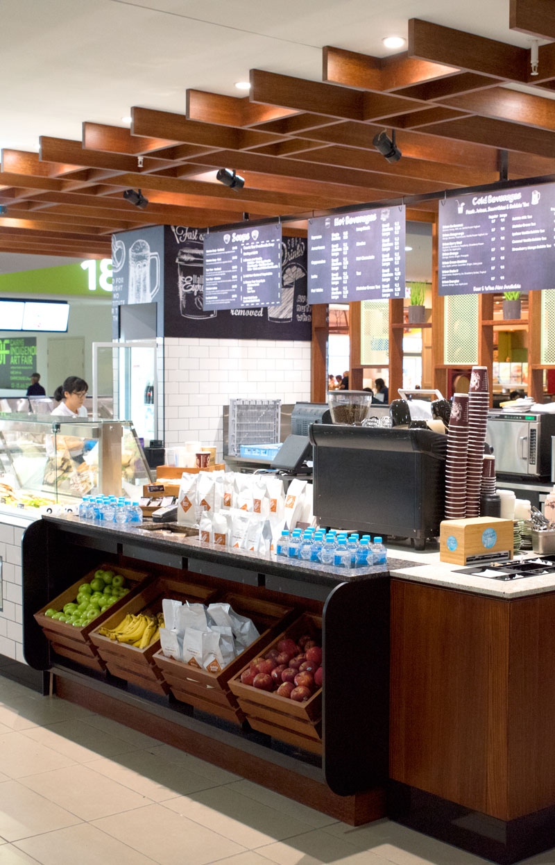
Urban Food Market is a fresh, quick service café offer that Myriad has implemented in several locations around the world. This outlet is a new approach to the fit out identity, developing a more contemporary detailing.