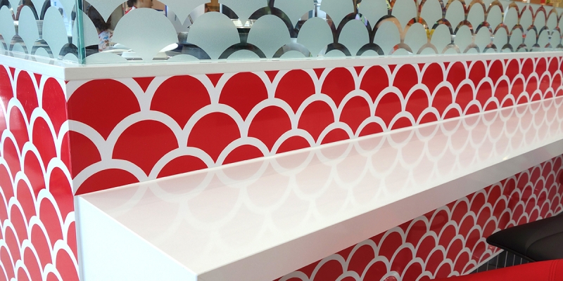
“The red & black scheme incorporates a signature ‘scale’ pattern as a surface treatment.”

“The red & black scheme incorporates a signature ‘scale’ pattern as a surface treatment.”
OK Sushi
our services: concept design, compliance & approvals, construction documentation
location: Redlynch Central SC; Clifton Village SC & Collins Ave, Edge Hill
size: 25sqm, 25sqm & 40sqm
completed: November 2014
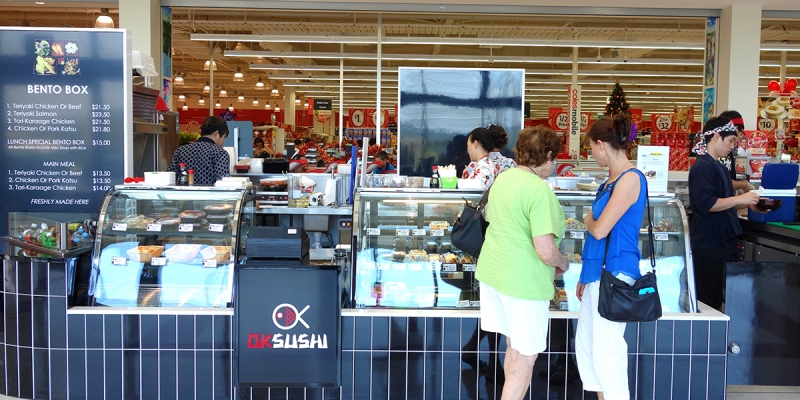
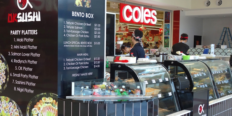
Our third project for OK Sushi has proven to be as popular as previous locations, achieving a faithful, regular customer base. The red & black scheme incorporates a signature ‘scale’ pattern as a surface treatment. The busy shopping centre environment requires a bold treatment graphically to attract the attention of new customers, whilst the kiosk form ensures that the showcase of fresh sushi is the hero.
Related Projects
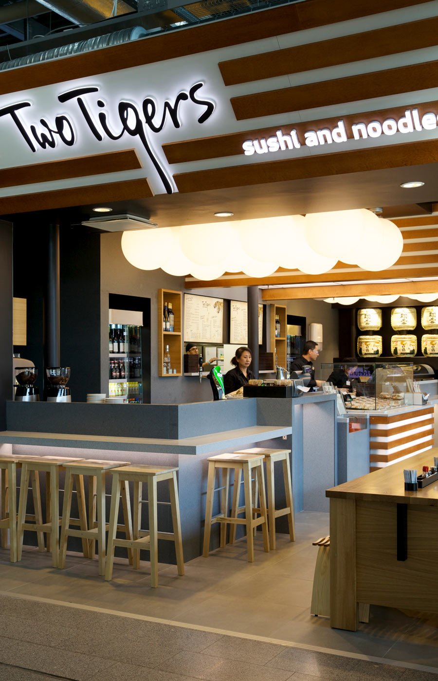
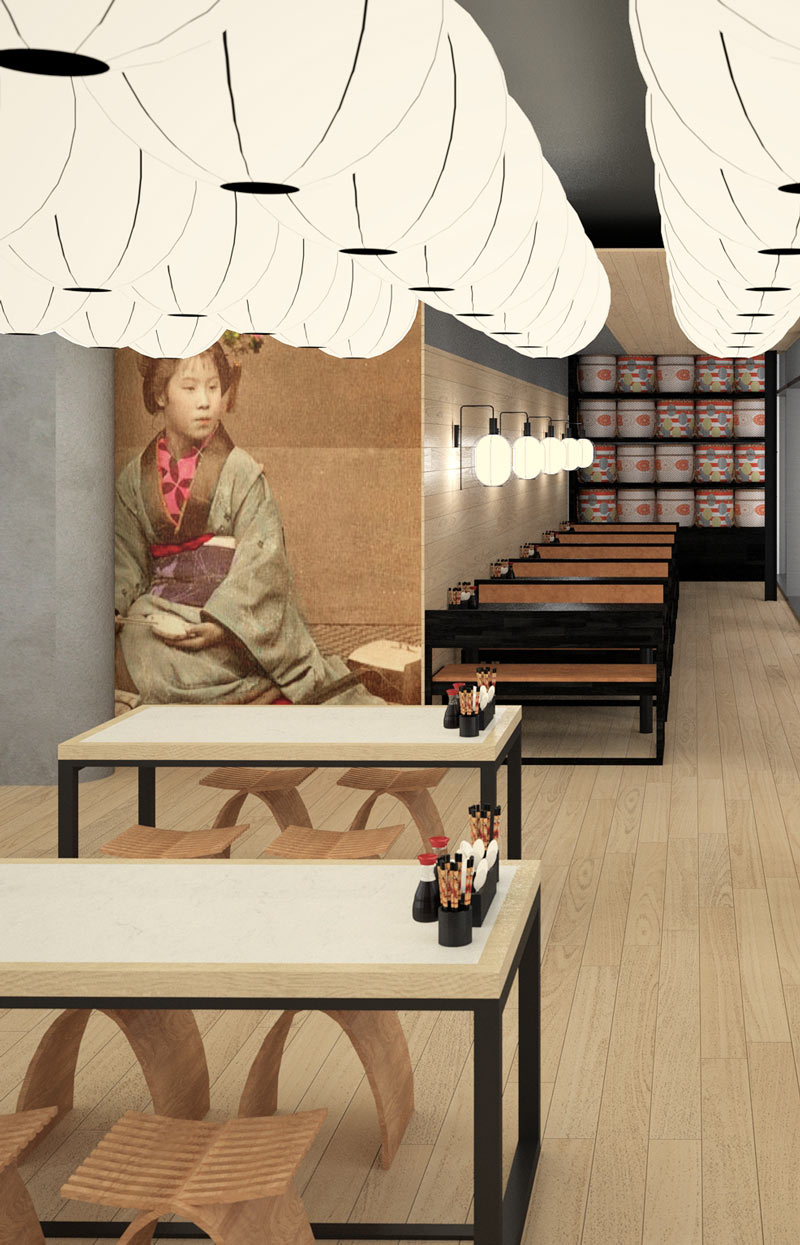
Originally the Two Tigers brand was developed for an Australian market application. After planning was undertaken for several Airport locations – luck would have it that Helsinki Airport, Finland would be the first location to open.
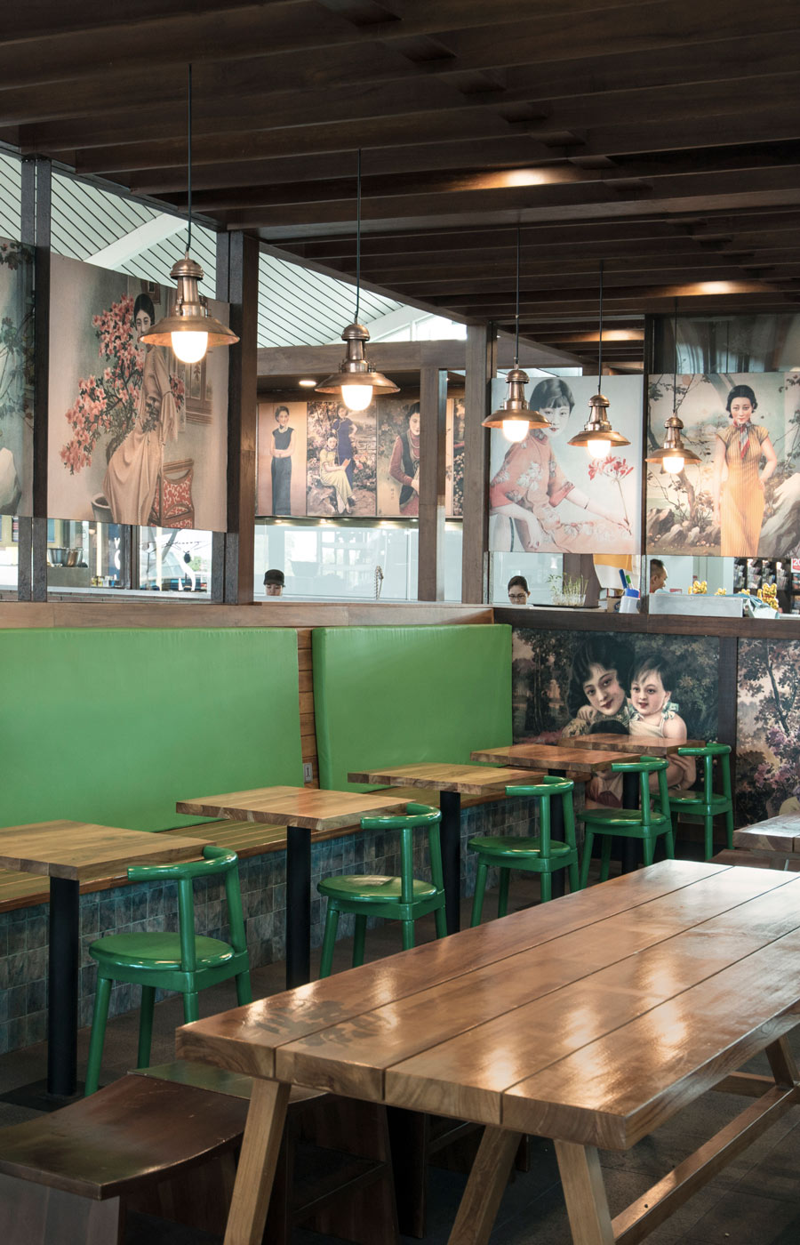
Drawing upon design styling influences from traditional urban Shanghai, the sheltering structure provides a comfort for waiting passengers & friends. The brand begins with its Two Dragons logo with a palette of green, black & rustic brickwork.
The expansion of the Two Tigers brand heads in to the Nordic region. The design incorporates the same counter format and signature décor that has proven effective and equally popular in other airport outlets. More importantly, the sushi chef remains the hero statement.

